12 Feb Taking Great Photos for Your Website
In today’s world, the way your website looks is far more important than what your website says. As humans we have short attention spans so when a client comes to your site you have about 10 seconds to make a good impression. Taking great photos for your website is one of the most important things you can do to make those ten seconds count and keep your users engaged and interested. Believe it or not it’s the photos that take a site from okay to amazing and vice versa. Most people won’t even read the content on your site – they will go straight for the crucial information and skip over the general info. Over the years I have noticed certain mistakes that clients make when gathering and taking photos. Here are some of my favorite tips on taking great photos for your website.
The Rule of Thirds
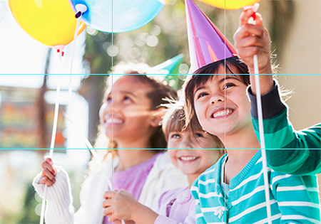
 The rule of thirds is an easy tip to remember and can make a big difference in your photo composition. Divide the shot into three imaginary columns both horizontally and vertically. You want your subject to sit within the axis points of those lines (Your iPhone and most cameras include a grid feature to help you line things up). Doing so will make your photo more visually interesting and will give your designer more to work with. I like to place text over photos and need some space to put things like call to actions or logos. Avoid putting the subject in the middle of the shot when possible.
Plan Ahead
When building websites, web designers use photos in a lot of different ways. There are wide home page sliders, blurry backgrounds, portfolios, page headers, online stores, and general pages that all require very different photos. Think about what you will be using the photos for ahead of time to save the headache of realizing you didn’t get the right shot. Take a wide variety of photos. I will leave a list below of the ideal type of photo for different sections of a website.
Home page sliders need very wide photos that aren’t tall at all. Slider photos are roughly 1900×500 pixels give or take a bit so they are often three times as wide as they are tall! One problem we run into is when the subject of a photo is too tall to fit leaving much of the subject cut off or too zoomed in. It is good to keep slider photo backgrounds fairly simple as well so any text that is laid over the photo is easy to read.

Backgrounds are often used to break up sections of a web page and can help make your site more visually appealing. They key to using photo backgrounds is to keep things very simple. They can either make a site look really amazing or really busy. We like to use blurred out images as backgrounds or simple textures or patterns.

Photos used on general information pages can bring some interest to a paragraph of simple text. Don’t worry about these too much; as long as the quality is good the photos should be fine. One thing I like to tell my clients is that landscape photos are better than portrait layouts. Our screens are wide and often times the content we write isn’t that lengthy. Because of those factors, portrait photos are usually very tall in comparison to the content it sits next to. Just something to keep in mind.
Use a Decent Camera
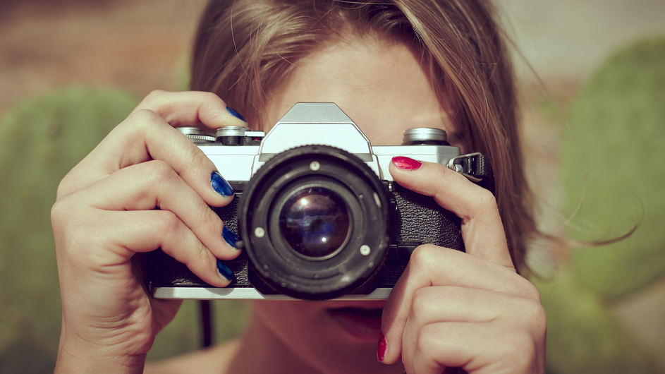
In order to take good photos you do not need to go and buy the most expensive camera on the market. For my blog I take a lot of photos with my phone and they turn out great! For a business though I would suggest using a decent camera that takes good quality photos. Things like sliders use very large photos and using a better camera may help you capture the best picture possible for that space. Different cameras are also good for different scenarios and can fix problems like lighting issues and can be more forgiving to a shaky hand than your iPhone. In my experience better quality photos always make for a better quality website.
Good Lighting is Important
 Photoshop can do a lot to help underexposed photos but taking the time to make sure the lighting is good will not only make your photos come out better but your website will look better as well. Against a white background, dark photos look dull and unprofessional. Go outside or near a window for the best lighting and try to find a spot with an even distribution of light. The top three lighting issues I see are overexposed photos, underexposed photos, and the worst – a mix of both. Photos with harsh shadows are hard to correct and often go unused.
Keep a Steady Hand
I receive a sets of photos from clients all the time that seem great only to find out that they are ever so slightly blurry. They take quick photos of their products or projects on their phones that look decent on a small screen but awful on my large desktop monitor. Sometimes we can make them work but blurry photos are never ideal. If you want to be sure you are taking a steady shot use a tripod or rest your arm on a steady surface to avoid shaking. Take your time and relax when taking photos for the best results.
I hope you found these tips on taking great photos for your website to be helpful! Have any other questions regarding this blog post or your website? Give us a call at (800) 991-4381 or contact us and we will be sure to help you out. Mahalo for reading!

No Comments